
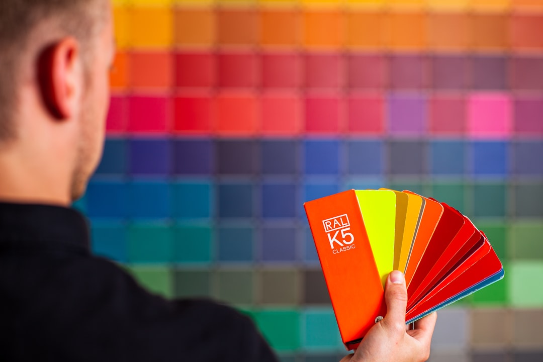
Choosing Colors for Your Website with Web Design Color Theory
Web Design Color Theory for Your Business Website
If you are building a business website, understanding Web Design Color Theory helps you choose colors that communicate your brand and guide user behavior. Color is not just decoration; it signals mood, priority, and trust. When used thoughtfully, it can improve readability, highlight calls to action, and reinforce your company’s story. This article breaks down practical steps you can take to apply color theory to a real world website without needing a color designer on every project.
Start with your brand basics and then translate them into accessible color options. The goal is a cohesive palette that feels intentional across pages, screens, and touchpoints. You will learn how to map color to audience expectations, how to balance aesthetics with accessibility, and how to test palettes in real world contexts. By the end, you should have a repeatable framework you can apply to future projects, blog posts, and client work. Web Design Color Theory offers a language for color decisions so your site communicates clearly and confidently.
Core Color Theory Principles for a Business Site
Color theory in the context of web design covers several practical ideas. It starts with a dominant brand color, then adds supporting hues and neutrals to build a palette that supports typography, imagery, and layout. You want colors that are legible on screens in daylight and in shadows, on phones and desktops alike. The following principles help you build a reliable base for your site.
First, consider contrast and readability. Sufficient contrast between text and background improves accessibility and reduces eye strain. A good rule of thumb is to test text against its background with a contrast checker that aligns with WCAG guidelines. Second, think about color temperature and mood. Cool colors tend to convey professionalism and calm, while warm colors feel energetic and inviting. Third, align color choices with brand associations. If your brand communicates reliability, a trustworthy blue might be appropriate. If creativity is your hallmark, consider accent colors that feel fresh but still readable. Fourth, integrate color psychology with action elements. Reserve bold colors for primary actions and use calmer neutrals for secondary tasks to create a visual hierarchy. Finally, treat neutrals as the glue. White, gray, and off white provide space for content and help the palette breathe, especially on dense pages like service descriptions or case studies.
- Contrast and accessibility: ensure text is legible against the chosen backgrounds.
- Brand alignment: pick colors that reflect your core values and market position.
- Color hierarchy: designate primary, secondary, and neutral roles for UI elements.
- Emotional resonance: use hues that evoke the desired feelings in your audience.
- Practical testing: simulate real user scenarios across devices and lighting conditions.
Branding and Palette Choices for Web Design
Your color strategy should serve branding as well as usability. A strong palette supports recognition and credibility, and it should extend naturally to logos, typography, imagery, and even micro interactions. Start by identifying one dominant color that anchors your brand. Then select two or three supporting hues that complement the dominant color without competing for attention. Finally, choose one or two neutrals that provide space and balance across layouts, buttons, and navigation bars.
When you select colors, think about accessibility from day one. A palette that looks great in a color wheel view may not perform well for users who rely on screen readers or have color vision deficiencies. Use high contrast for body copy, and avoid color alone as the sole signal for important actions. If you must rely on color to indicate status, pair it with an easily recognizable icon or label. This approach keeps your site usable by a broader audience while preserving a striking visual identity.
A Step by Step Method to Pick Your Palette
Use a repeatable process so color decisions become a predictable part of your design workflow. The steps below are practical and scalable for single sites or an agency with multiple clients.
- Define your brand personality and audience. Write down three adjectives and the top emotions you want visitors to feel when they visit your site.
- Choose a dominant color that reflects that personality. This color will appear in your logo, header, or primary CTA.
- Build a supporting color set. Pick 2 to 3 hues that harmonize with the dominant color, using one tint and one shade as needed.
- Select neutrals. Choose white, off white, or gray tones to support readability and create negative space.
- Test accessibility. Check contrast ratios for body text, headings, and UI components across devices.
- Apply the palette to key elements and collect feedback. Iterate based on usability and alignment with brand messaging.
For quick iteration, you can mock up page variations with a color preview tool. Tools like MakeWebsite.now can help you see how different color schemes interact with layout blocks in seconds, which speeds up decision making and reduces back and forth. This kind of real time preview supports faster consensus and confidence in your final choice.
Testing Your Colors Across Scenes and Devices
Testing is the bridge between theory and reality. A color palette may look different on a bright smartphone screen than it does on a dim laptop display. The goal is a palette that remains legible, accessible, and brand aligned across environments. Here are practical steps to test effectively.
- Review contrast on body text, headings, and UI copy using automated contrast checks against WCAG 2.1 standards.
- Preview color pairs on both light and dark modes. Ensure there is enough separation for critical actions in both modes.
- Assess color consistency on mobile, tablet, and desktop. Colors should render similarly while respecting device color profiles.
- Simulate color blind scenarios. Use color palettes that remain distinguishable to users with common deficiencies by pairing color with text or icons.
Remember that color is just one aspect of a site’s design system. Typography, spacing, imagery, and interactive states also influence how a palette performs. If you can, run quick A/B tests on a storefront page or pricing section to see how color changes affect engagement metrics in your specific context.
Common Misconceptions About Color in Web Design
A frequent misunderstanding is that color alone determines a brand’s success. In reality, color is one piece of a larger system that includes typography, imagery, layout, and copy tone. Another misconception is that darker colors always look premium; while depth can imply quality, excessive darkness can reduce readability and accessibility. Some assume more color always means better engagement; in truth, too many hues can create visual noise and distract users from your message. The strongest sites intentionally limit their color set and use contrast and hierarchy to guide attention.
Techniques like color grouping and consistent use of neutrals help maintain clarity. If you are unsure about the right balance, start with a restrained palette and gradually introduce accent colors in UI elements that deserve emphasis, such as CTAs or key links. This measured approach keeps the user experience tidy while still allowing for expressive branding.
Frequently Asked Questions
What is the best color scheme for a small business website?
The best scheme starts with your brand personality and target audience. A simple, high contrast palette with one dominant color and two supporting hues often works well. Accessibility and readability should guide your final choices just as much as aesthetics.
How many colors should a website use?
A practical rule is to use up to five colors for UI elements, with neutrals handling the majority of the page background and typography. Reserve one bold color for primary actions, one secondary color for highlights, and the rest for accents or status indicators.
How do I ensure color accessibility on my site?
Use a contrast checker to verify that text and interactive elements meet AA or AAA standards. Combine color with icons or labels for important signals, and test your palette under different lighting conditions and on mobile screens.
Can color influence conversions on my site?
Color can impact user perception and behavior when paired with clear messaging and strong hierarchy. The color used for calls to action should stand out without clashing with the overall design, and content should remain readable across all devices.
Should I use the same colors across all pages?
Yes for branding consistency, but you can introduce subtle variations to signal different sections. A core palette should remain constant while neutrals and accent tones adapt to page context and user tasks.
Conclusion: Web Design Color Theory in Practice
In practice, Web Design Color Theory is a practical framework for making consistent, audience oriented color decisions. Start with a solid base that reflects your brand, then build a palette that supports readability, accessibility, and a clear hierarchy. Test across devices and lighting, gather feedback, and iterate. With a methodical approach, color becomes a reliable tool for storytelling and user experience. If you want to visualize how your colors work in real time, MakeWebsite.now can generate quick demos to help you see the palette in action and refine your choices accordingly. By applying these principles, you will create a website that communicates your value, respects accessibility, and looks cohesive across touchpoints.