
By HaWa · Updated July 23, 2026
› Design for one job
A contractor page, a salon page, and a consultant page should not look interchangeable after you swap the logo. Start from the right vertical cues in industries and real outcomes in website examples, then polish in the website editor.
If removing a border, shadow, or badge does not hurt understanding, remove it. Enquiry pages fail from clutter more often than from “not enough sections.”
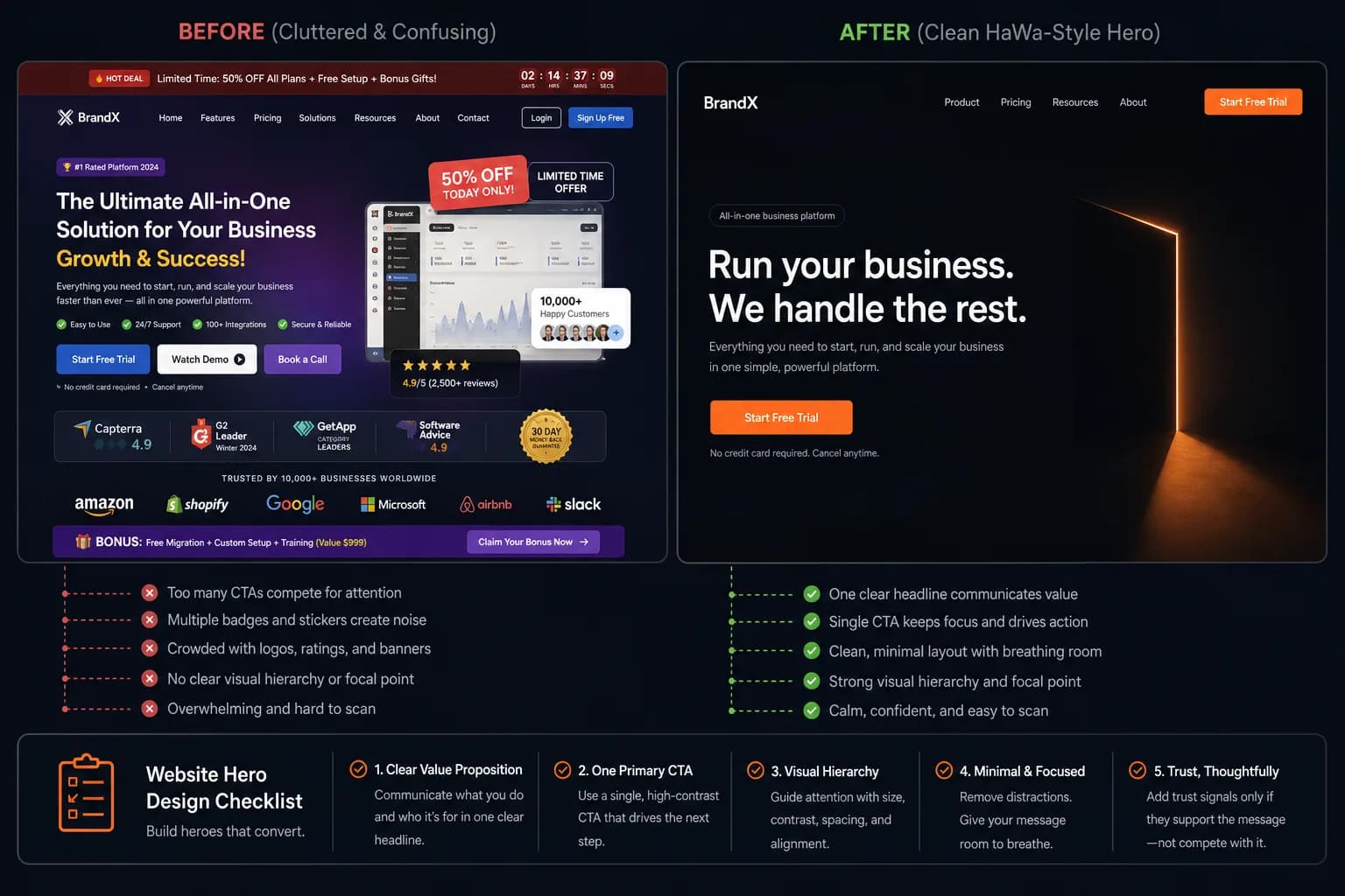
› First viewport (above the fold)
- ☐Brand or business name is unmistakable without reading the nav.
- ☐One headline states the offer — not a vague slogan.
- ☐One supporting sentence max under the headline.
- ☐One primary CTA group (and optional phone) — not five equal buttons.
- ☐Hero imagery shows your work, place, or people — not abstract purple blobs.
- ☐No floating promo stickers or badge clusters on top of the hero.
› Trust & content design
- ☐Services are scannable (short names + one-line outcomes).
- ☐Proof is specific: named reviews, license #s, before/after jobs — not “trusted by many.”
- ☐Contact details appear before the footer on long pages.
- ☐Photos are cropped consistently; avoid stretched logos.
- ☐Section order matches buyer questions: offer → proof → process → contact.
- ☐Legal/required disclosures (brokerage, equal housing, etc.) are readable, not hidden.
› Mobile & interaction
- ☐Primary CTA reachable with one thumb scroll on a phone.
- ☐Tap targets ≥ ~44px for buttons and phone links.
- ☐Text does not overflow or collide at 375px width.
- ☐Forms show clear labels; required fields are obvious.
- ☐No horizontal scroll caused by wide images or tables.
- ☐Click-to-call works on mobile for phone numbers.
› How to apply this on a HaWa draft
- 1
Generate with style intent in the brief
Mention tone (clean, bold, calm) and must-have sections in the generator brief. Better inputs beat fighting the layout later. - 2
Edit for truth, then for hierarchy
In the editor, fix facts first. Then shorten headlines until the primary offer is obvious in three seconds. - 3
Swap stock for real proof
Replace generic imagery with your jobs, salon interior, or team headshot. Design quality jumps more from real photos than from another font tweak. - 4
Verify the form still converts
After visual edits, submit a test via contact forms so design polish didn’t break the enquiry path.
When to stop designing
Ship when a stranger can answer: what you do, where, why trust you, and how to reach you. Further polish is optional; a live accurate page beats a perfect unpublished mock.